
Ebola Awareness and Information Website

Project Description
This project involved designing and developing a responsive website dedicated to spreading global awareness about the Ebola virus. The goal was to provide reliable, accessible, and up-to-date information for individuals especially in regions with limited access to health education. The site includes sections on prevention, symptoms, transmission, and treatment, presented in clear and simple language. Its user-friendly design, visual hierarchy, and mobile responsiveness ensure that people around the world can easily find and understand critical health information.
Project Problem
In many parts of the world especially in rural or developing regions people lack access to accurate and up-to-date information about the Ebola virus. Misinformation, language barriers, and limited internet resources make it difficult for individuals to understand how the disease spreads, what symptoms to look for, and how to protect themselves and their families. Without a trusted and centralized digital source, communities remain vulnerable to fear, confusion, and delayed responses during outbreaks.
Empathize
Pain Points
This display highlights the main challenges users face when searching for Ebola information online. Many people struggle with unclear next steps during emergencies, dense medical terminology, and uncertainty about which sources to trust. The pain points also show how poor mobile layouts can hide important details like symptoms or prevention tips. These insights reveal exactly why a clearer, simpler, and more trustworthy website is needed.
Personas
This introduces two key users: Marie Joseph, a caregiver who needs simple, trustworthy guidance to protect her family, and Samuel Akoto, a public health student who relies on accurate, real-time data he can trust. Marie wants clear steps without medical overload, while Samuel gets frustrated by cluttered layouts, missing timestamps, and text-heavy pages. Together, these personas show the need for a website that is both easy to understand and reliable for quick, informed decision-making.
User Journey
This maps out how both Marie Joseph and Samuel Akoto move through the Ebola Info Center and what challenges they encounter along the way. Marie focuses on finding simple guidance to protect her family, while Samuel searches for reliable data he can use for school and community updates. Their journeys reveal pain points like repetitive information, missing filters, confusing layouts, and difficulty finding credible sources quickly. By comparing both experiences, the design team can clearly see where the website needs clearer navigation, trusted content, and easier ways to share information.
Define
Problem Statement
This outlines the core problems faced by both Marie Joseph and Samuel Akoto when searching for Ebola information. Marie needs clear, simple explanations that help her protect her family without feeling overwhelmed by technical language or confusing layouts. Samuel needs credible, real-time data he can verify and share confidently, but often runs into cluttered sites or outdated information. Together, these problem statements highlight the need for a platform that is both easy to understand and trustworthy.
Hypothesis Statement
The hypothesis statements explain how the redesigned platform will better support both users. If the site provides plain language, strong visuals, real-time updates, and clearly sourced information, then Marie will feel less overwhelmed and more confident taking action, while Samuel will trust the data enough to use it for research and community outreach. Both users benefit from a cleaner layout and simplified experience, making them more likely to return and share the site with others.
Goal Statment
The main purpose of the Ebola Info Center website and who it is designed to support. The goal is to help caregivers, students, and community members quickly understand Ebola symptoms, prevention steps, and real-time outbreak data through a simple, mobile-friendly interface. By using clear language, strong visuals, and verified sources, the site aims to reduce confusion and build user trust. Success will be measured by engagement metrics such as time on page, repeat visits, and whether users complete key actions like sharing information or contacting support.
Project Goal
The goal of this project is to create an accessible, user-friendly website that educates people worldwide about the Ebola virus. The site aims to provide accurate information on symptoms, prevention, and treatment in a simple and visually engaging way. By organizing verified health resources into one digital platform, the project seeks to raise awareness, combat misinformation, and promote early prevention—especially for communities with limited access to healthcare education.
Tools
-
Next.js – for building a fast, server-rendered, and SEO-friendly web application.
-
External API Integration – to retrieve and display real-time data about Ebola outbreaks and statistics.
-
Figma – for wireframing, prototyping, and designing the user interface before development.
-
Tailwind CSS – for fast, consistent, and mobile-friendly styling using utility-first design principles.
-
External API Integration – to display real-time data and updates about Ebola cases and information.


Ideate
How Might We
This breaks the project’s challenges into clear opportunity areas using “How might we” questions to guide creative problem-solving. Each category like Discoverability, Understanding, Trust, Accessibility, and Engagement highlights a specific barrier users face when trying to learn about Ebola. These questions help the design team explore solutions such as clearer navigation, simpler language, verified sources, and more inclusive layouts. Overall, the section ensures the project stays focused on designing a website that is easy to use, trustworthy, and supportive for all types of users.
Site Map
The sitemap illustrates the overall structure and information hierarchy of the Ebola Awareness Website. It was designed to ensure users can easily access essential information about the Ebola virus, from understanding symptoms to learning about prevention and live outbreak updates. This clear, top-down organization allows users to navigate intuitively while maintaining a consistent and logical flow. Creating this sitemap helped define the core content strategy, streamline navigation, and establish a strong foundation for the wireframes and overall site design.
HOW MIGHT WE
Discoverability & Navigation
-
How might we help users quickly find critical Ebola information without feeling overwhelmed?
-
How might we design intuitive navigation for users with limited digital literacy or internet experience?
Product Understanding & Confidence
-
How might we present symptoms and prevention steps in a way that feels simple, accurate, and easy to act on?
-
How might we use visuals and plain language to help users better understand complex health information?
Checkout & Trust
-
How might we help users feel confident that the Ebola information is coming from reliable, up-to-date sources?
-
How might we reinforce the trustworthiness of the site through design, tone, and verified content?
Accessibility & Inclusion
-
How might we make the site usable for people with low reading levels, anxiety, or unfamiliarity with health websites?
-
How might we reduce cognitive load so users can focus on the most important actions quickly, especially in a crisis?
Engagement & Personalization
-
How might we empower users to share health information with their family and community?
-
How might we encourage users to return to the site or subscribe for outbreak updates?

Prototype
Wireframes
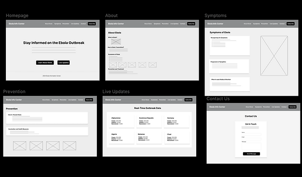
The wireframe stage focused on laying out the structure and information hierarchy of the Ebola Awareness Website. I created low-fidelity wireframes in Figma to visualize the layout of key pages Homepage, About, Symptoms, Prevention, Live Updates, and Contact. This stage allowed me to define content placement, navigation flow, and call-to-action areas without the distraction of color or visuals. The goal was to ensure that users could easily find critical information about Ebola, such as symptoms and prevention tips, through a clear and intuitive design.
Prototype Lo-fi
After finalizing the wireframes, I developed an interactive prototype to test how users would move through the site. Using Figma’s prototyping tools, I connected each page and created a clickable flow from the homepage to the other main sections. This helped simulate real user interactions and verify that the navigation was smooth and consistent. During this stage, I focused on usability making sure users could quickly access live updates, learn about prevention, and contact support without confusion or extra steps. The prototype provided an early preview of the site’s functionality before development.

Mock-ups
I transformed the prototype into a high-fidelity mockup with full color, typography, and imagery. I applied a clean, professional aesthetic using blue for trust, yellow for emphasis, and white backgrounds for readability. The mockup reflected the final design direction that was later developed using Next.js and Tailwind CSS. Each page was refined for clarity, visual balance, and accessibility, ensuring a polished and consistent look across all screens.

Responsive
In developing this website, I prioritized a mobile-first, responsive layout to ensure that users can access Ebola-related information seamlessly on any device from smartphones to large desktop screens. The result is a fully adaptive experience that maintains visual balance and usability across all screen sizes. The responsive adjustments also improve accessibility, making it easier for users in different regions and devices to access life-saving health information quickly and clearly.

Testing
Research Study
This display outlines the full plan for the Ebola Info Center usability study, including the project background, research goals, and the key metrics used to evaluate the website. It explains that the study aims to determine whether users can easily find symptoms, prevention details, and live outbreak data while also measuring trust, navigation clarity, and overall usability. By defining clear research questions and KPIs, this section shows how the study will uncover issues in readability, exploration, and task success across all participants.
Usability note-taking spreadsheet
This display explains how the usability spreadsheet captures exactly how each participant moved through the Ebola Info Center prototype. For every task, the spreadsheet organizes insights into four key columns that reveal behavior, confusion, and user thought patterns.
-
Click Path – Documents the exact steps participants took, including what they tapped, how they navigated, and where they hesitated or clicked the wrong element.
-
Observations – Records your interpretation of their reactions, confidence level, confusion, pauses, or frustration as they completed each task.
-
Quotes – Captures real statements from participants that reveal their thought process, such as “I thought it was missing,” or “This looks good,” giving context to their actions.
-
Task Completion – Rates how successfully each participant completed the task (1 = easy, 2 = difficult, 3 = not completed), showing which areas of the prototype supported users and which caused barriers.
This display summarizes how all five participants Mom, Dad, Sister, Junior, and Justin interacted with the website across each assigned task. The click paths, observations, and quotes reveal consistent patterns, such as users pausing on medical terms, skimming long paragraphs, struggling to find live update data, or feeling uncertain about the contact form. Some participants highlighted positives like visuals and simple explanations, while others pointed out confusion or missing guidance. Together, this section captures real user behavior and feedback, giving clear insight into what needs improvement in future design iterations.
Affinity board Analysis
This organizes all usability study observations into four major themes. Finding Critical Information, Clarity & Confidence in Content, User Understanding & Trust, and Prototype Limitations & Form Friction. Each sticky note represents real feedback from participants, Mom, Dad, Sister, Junior, and Justin, highlighting moments where users hesitated, felt confused, missed visual cues, or needed clearer guidance. Together, these themes reveal consistent patterns in navigation, content structure, data trust, and form usability. This visual clustering helps identify the areas that need the most improvement before moving into the next design iteration.
Prioritized Insights Template
This organizes all usability insights into three priority levels, showing which issues must be addressed first to improve the Ebola Info Center.
-
Priority 0 insights highlight the most urgent problems, such as users struggling to find their country in Live Updates, uncertainty about data sources, and confusion in the contact form issues that directly impact trust and task success.
-
Priority 1 insights focus on important navigation and clarity issues, such as unclear labels, confusion around the subscribe button, and low CTA visibility.
-
Priority 2 insights capture medium-level improvements, including grouping countries more logically, guiding users between sections, and offering clearer comparisons.
Together, these priorities help the design team focus on changes that will have the greatest impact on usability and user confidence.


Refining the Design
Live Updates (Desktop)
The Live Updates page was redesigned to help users quickly find their country and trust the outbreak information shown. Filters, sorting options, and clear data labels were added after participants struggled to scan long lists and questioned where the data came from. The updated layout is more organized and visually structured, helping users locate real-time numbers confidently and efficiently.
Contact Form
Usability testing revealed that users felt unsure about what to write in the contact form and expected more guidance. The redesign introduces clearer labels, descriptive placeholder text, and a more balanced layout to reduce confusion. These improvements ensure users feel supported when reaching out and can complete the form without hesitation.
Mobile Live Updates
On mobile, users had difficulty scrolling, finding their country, and reading overcrowded cards in the original design. The updated mobile layout introduces simplified cards, better spacing, and country flags that help users scan information faster. These changes create a smoother and more intuitive mobile experience, especially important for users accessing outbreak data on the go.
Before Usability
After Usability


Color Palette and Accessbility
The color palette was designed to build trust and guide users through important health information with clarity. Blue (#4C7CF2) was chosen for its calm and dependable tone, creating a sense of reliability that’s essential for a health-focused website. Bright green (#4ADE80) and yellow (#FACC15) highlight active states and key actions like “Subscribe,” making interactions feel approachable and clear. Neutral shades of white and gray balance the layout and enhance readability. Together, these colors maintain strong contrast and meet accessibility standards, ensuring the interface remains inclusive and easy to navigate for all users
Color Palette and Accessbility
Figma Design

The Figma design represents the initial concept and user interface layout of the Ebola Info Center website. It focuses on visual hierarchy, color contrast, and clear navigation to guide users through key information such as outbreak data and prevention tips. This stage allowed for quick iteration and alignment on the structure before moving into development.
Coded Website

The coded version translates the Figma design into a fully functional web page built with React and Tailwind CSS. It preserves the same layout and visual identity while adding responsive behavior and interactivity. This version demonstrates the transition from design to development and how the planned experience was implemented in real code.
Design to Development Showcase
A comparison of the CampEasy prototype and the coded landing page.
Key Takeaways
Impact
The improvements made to the Ebola Info Center allowed users to access outbreak data more easily, especially by introducing search and filter features. Participants felt more confident navigating the site and appreciated the clarity in how information was structured, particularly in the Live Updates and Contact sections.
What I learned
Through this project, I learned how important clear content structure and thoughtful interactions are when sharing critical health information. I gained experience designing for accessibility, implementing filtering/search functionality, and running usability studies to uncover confusion points such as missing placeholders or poor data labeling.
Next Steps
1. Add region-based outbreak insights
Introduce a feature that breaks down outbreak data by global regions (e.g., West Africa, Central Europe) to help users quickly identify trends based on geography and understand local context.
2. Collaborate with health experts for content accuracy
Partner with public health professionals to review and verify all medical content, ensuring that users receive information that is up-to-date, credible, and relevant to current outbreaks.
3. Integrate educational resources and visuals
Develop interactive infographics and simple animations that explain how Ebola spreads, how to prevent infection, and how treatment works — especially for users with limited literacy or medical background.