
CampEasy: Simplifying the Camping Gear Shopping Experience
Project Description
I designed CampEasy, a responsive mobile app for outdoor enthusiasts who want a simpler way to shop for camping gear. The app is targeted at beginner and intermediate campers who often feel overwhelmed by too many product options, unclear information, and confusing navigation on traditional eCommerce sites. CampEasy helps users quickly find the right gear with smart filters, clear product details, and a streamlined checkout process making the camping shopping experience stress-free and trustworthy.
Following the design thinking process, I conducted user research, defined pain points, and ideated solutions like smart filters and beginner-friendly guides. I then designed clean, intuitive interfaces and built a high-fidelity prototype in Figma. The final product prioritizes simplicity, trust, and a seamless shopping experience across devices.
Project Problem
Many beginner and intermediate campers struggle when shopping for gear online. Traditional eCommerce platforms often present too many options, with unclear product descriptions and complex navigation. This creates frustration, wasted time, and uncertainty about making the right purchase.
Project Timeline
This project took about two months to complete, as I was learning and applying the different stages of the product development cycle. Throughout the process, I maintained a UX designer’s approach focusing on user-centered design, research, and iterative improvements to ensure the product met both functional and emotional needs of its target users.
Project Goal
The goal of the project was to design a simple, intuitive app that makes shopping for camping gear easy and enjoyable. By focusing on clear product details, smart filtering, and a streamlined checkout, the app aims to help campers confidently find the right equipment without feeling overwhelmed.
1
Empathize
User Research
To better understand user needs, I relied on secondary research, including competitor analysis, customer reviews, and online forums like Reddit and camping blogs. I began with the assumption that users mainly cared about product variety and price. However, as I explored user feedback on outdoor gear websites, I noticed recurring frustrations around complex navigation, unclear product information, and overwhelming options. This shifted my perspective highlighting the importance of simplicity, guidance, and trust-building features, especially for less tech-savvy users or first-time campers. These insights helped shape user personas and informed key design decisions.
Personas
In this project, we created two user personas to guide the design:
Andrew Thompson is a busy marketing manager who enjoys weekend camping but struggles to find reliable gear quickly due to confusing websites. His needs center around speed, clarity, and trust in product quality.
Michael Burch is a retired professor who values simplicity and clear navigation. He often feels overwhelmed by cluttered online stores and needs a straightforward, stress-free shopping experience.
These personas helped shape design decisions that prioritize ease of use, product transparency, and a smooth shopping experience for both tech-savvy and less experienced users.
User Journey Maps
The user journey maps created outline the key steps Andrew Thompson and Michael Burch take when shopping for camping gear online. Each journey highlights their goals, tasks, emotions, and pain points across six main actions from realizing their need for gear to completing a purchase.
By mapping these journeys, we identified moments of confusion, frustration, or hesitation, such as difficulty finding the right products or feeling uncertain at checkout. These insights helped us uncover improvement opportunities and design a smoother, more user-friendly experience tailored to each persona’s needs.


2
Define
Problem Statement
In the Define stage, the problem statement is used to clearly frame the user’s challenge in a way that highlights their needs and frustrations. For the Camping App, the problem statements show how users like Michael, a retired professor, and Andrew, a busy marketing manager, struggle with existing shopping experiences. Michael needs simplicity and clarity so he doesn’t waste energy navigating confusing interfaces, while Andrew needs speed and reliability to shop quickly on his phone. These problem statements ensure the team is focused on solving the right issues rather than jumping straight into design ideas.
Hypothesis Statement
The hypothesis statement builds on the problem statement by predicting how a potential solution will improve the user’s experience. It connects a proposed action such as creating a streamlined mobile shopping flow with clear navigation and trustworthy reviews to a measurable outcome, like reducing frustration and increasing confidence in purchasing. This helps the team validate whether their design ideas are on the right track and provides a clear benchmark for testing later in the process.
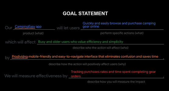
Goal Statement
The goal statement then defines the desired outcome of the design in a forward-looking way. For the Camping App, the goal is to let users quickly and easily browse and purchase camping gear online, especially targeting busy and older users who value efficiency and simplicity. It explains how the app will achieve this through a mobile-friendly, easy-to-navigate interface—and how success will be measured, such as by tracking order completion and time spent browsing. This statement sets a clear direction for the design work, ensuring the solution directly addresses user needs identified in the problem statements.


3
Ideate
In the ideate stage of the product development cycle, I focused on generating a wide range of creative ideas to solve the problems identified during the Define phase. I began by reviewing the personas, user pain points, and problem statements gathered from earlier research. From there, I crafted How Might We (HMW) questions to reframe user challenges into design opportunities.To inspire and inform my ideas, I also conducted a competitive audit of four companies (REI, Backcountry, Walmart, and Amazon) to evaluate their strengths, weaknesses, and feature sets.
How Might We's (HMW)
In the Ideate stage, the How Might We questions act as springboards for generating creative solutions to the problems uncovered during research. For the Camping App, these questions address key areas like discoverability, navigation, product confidence, checkout, accessibility, and engagement. They reframe challenges such as users feeling overwhelmed by product choices or distrusting the checkout process into opportunities for innovation. For example, “How might we build trust for users who are hesitant to purchase gear online?” encourages thinking about secure payment design, transparent reviews, or clear order confirmation. By framing problems this way, the team ensures brainstorming stays focused on user needs while exploring multiple directions for improvement. These prompts guide ideation toward creating a more trustworthy, accessible, and personalized shopping experience.
Storyboard
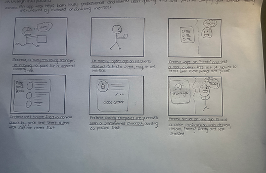
This storyboard illustrates how Andrew, a busy marketing manager, uses the Camping App to quickly prepare for a weekend trip. It shows his journey from feeling stressed about packing to finding relief with the app’s simple and clutter-free interface. Andrew browses categories, applies filters to narrow his options, and selects a tent that meets his needs. He then completes a streamlined checkout without extra steps and receives a clear order confirmation. By the end, Andrew feels ready and less stressed. The storyboard highlights the app’s focus on simplicity, efficiency, and trust, showing how it supports users in making quick, confident purchases.
Userflow
The user flow for the Camping App outlines the key steps a customer takes to browse and purchase gear. The journey begins when the user opens the app and lands on the homepage, then navigates through gear categories to reach a product list. From there, the user selects an item to view its details and can add it to the cart. After reviewing the cart, they proceed to checkout and receive an order confirmation. At the end of the flow, the user can either exit the app or leave feedback on a dedicated page. This flow captures a typical e-commerce experience, showing how the app enables quick navigation from browsing to purchase while also offering an option to share feedback.
HOW MIGHT WE
Discoverability & Navigation
-
How might we help users quickly find the right camping gear without feeling overwhelmed?
-
How might we make navigation simple and intuitive for users with limited online shopping experience?
Product Understanding & Confidence
-
How might we present product details in a way that builds trust and supports confident decision-making?
-
How might we use visuals and descriptions to clearly differentiate gear for beginners and experienced campers?
Checkout & Trust
-
How might we simplify the checkout process to make it feel secure and hassle-free?
-
How might we build trust for users who are hesitant to purchase gear online?
Accessibility & Inclusion
-
How might we design an experience that’s friendly and usable for older or less tech-savvy users like Michael?
-
How might we reduce visual or cognitive load to make browsing more comfortable?
Engagement & Personalization
-
How might we guide users to the right gear based on their camping style or skill level?
-
How might we use customer reviews or community tips to create a more engaging shopping experience?

4
Prototype
In the Prototype phase, the goal is to transform ideas from the ideation stage into tangible representations that can be tested with users. For the Camping App, this involved creating both a storyboard and a wireframe. Together, these prototypes made it possible to quickly test assumptions, validate user flows, and identify areas of confusion early on. This phase emphasized building low-fidelity artifacts that could be iterated on, ensuring the design direction aligned with user goals before moving into high-fidelity design.
Wireframe
This wireframe represents the low-fidelity prototype of the Camping App, outlining the core screens and navigation flow for a typical shopping experience. It begins with the homepage, which includes a search bar, image carousel, and product grid for quick discovery. The category and product list screens guide users into browsing specific gear, while the product details page highlights price, size, color options, and related products. From there, users can add items to their cart, view a simple checkout page, and proceed to a confirmation screen that reassures them their order was successful. A profile page is also included, giving access to order history, saved items, and account settings.
The wireframe emphasizes clarity and usability, stripping away visual styling to focus on structure, navigation, and functionality. By mapping out the essential user journey from browsing to checkout and account management it provides a foundation for testing navigation flow, identifying gaps, and refining the design before moving into higher-fidelity prototypes.
Prototype Lo-fi
In the Prototype phase, I created a low-fidelity prototype in Figma to map out the core user journey of the Camping App. Using simple grayscale wireframes, I focused on structure, layout, and navigation without adding detailed visuals or branding. I then connected the screens in Figma to simulate key interactions, such as moving from the homepage to categories, viewing product lists, checking product details, adding items to the cart, and reaching the confirmation page. I also included a profile section with options like order history and saved items, even if they were non-functional at this stage, to test navigation flow. This lo-fi prototype allowed me to quickly test usability, identify pain points, and validate whether the app’s flow felt simple and intuitive before moving to higher-fidelity design.


5
Testing
In the testing phase, I focused on evaluating how well my design worked for real users by gathering direct feedback through usability testing sessions. I observed participants as they interacted with the prototype, noting where they succeeded, where they struggled, and how they felt during the process. This helped me identify areas of friction, such as unclear navigation or steps that took longer than expected. I recorded their actions, comments, and behaviors, then compared these insights to the original goals of the project. By doing this, I was able to validate what worked, uncover opportunities for improvement, and prepare recommendations for the next iteration of the design.
UX Research Study
In the testing phase, I conducted a structured Research study to evaluate the camping gear app prototype. The plan outlines the background, research goals, and key questions, such as whether users can successfully browse, find product details, add items to the cart, and complete purchases. Participants will include a mix of beginner and experienced campers, with testing taking place remotely. The methodology focuses on an unmoderated usability study, where participants will follow a series of scripted prompts, including finding a product, checking details, adding it to the cart, and completing checkout. Key performance indicators like time on task, conversion rate, and drop-off points will be used to measure success.
During the sessions, participants will be asked to share their thoughts and feelings about each step, including whether categories are clear, product details are useful, and the confirmation screen is reassuring. Afterward, they will complete a System Usability Scale (SUS) questionnaire to provide structured feedback on ease of use and overall satisfaction. This plan ensures that the study will capture not only user behaviors but also uncover deeper insights about trust, navigation, and confidence in the app’s design.
Usability Study note-taking SpreadSheet
The spreadsheet I created is a structured usability note-taking tool that captures how each participant moved through the test. For every prompt, I documented four key areas:
-
Click Path – the exact steps the participant took on the prototype, such as which icons they tapped, how they navigated categories, and where they made errors or hesitated.
-
Observations – your interpretation of their behaviors, attitudes, and level of confidence, including moments of confusion, amusement, or frustration.
-
Quotes – direct statements from the participant that reveal their thought process, such as “Oops, wrong button” or “This looks good enough,” which give context to their actions.
-
Task Completion – a rating scale (1 = easy, 2 = completed with difficulty, 3 = not completed) that shows how successfully they managed each task.
By filling this out during testing, I created a clear record of not only what participants did, but also how they felt and what slowed them down. Each participant’s notes allow you to see patterns across users like repeated confusion with icons, hesitation around the cart, or frustration with inactive buttons—which then feed into your insights and design recommendations.
Affinity Boad Analysis
During the Test Phase, I organized my usability findings into an affinity board, which helped me cluster patterns across participant behaviors. The board revealed four main themes: trust and cart concerns, where users often double-checked or hesitated with checkout; decision-making and confidence, with some participants scanning carefully while others clicked quickly or randomly; prototype limitations, where missing features caused confusion and mild frustration; and navigation issues, such as hesitating with icons or clicking the wrong ones before correcting. By grouping these observations into themes, the affinity board made it clear where users struggled most and highlighted opportunities to improve trust signals, decision support, and navigation clarity in the next design iteration.
Insight Priority Template
From the usability testing, I gathered prioritized insights that highlighted the most pressing issues. At the top level, participants showed a lack of trust in the cart contents, which pointed to the need for a cart review step to reassure users before checkout. Other critical issues included mismatched cart items, missing review steps that caused hesitation, and users double-checking the cart to confirm order accuracy. These insights made it clear that transparency, accuracy, and a clear review process are essential to creating a trustworthy shopping experience.
At lower priority levels, I observed usability issues such as confusion with bottom navigation icons, unclear category labeling, and participants overlooking reviews or important details like price. Some users tapped inactive buttons or ignored placeholder text, showing the need for better visual hierarchy, clearer affordances, and setting expectations in prototypes. Interestingly, experienced users adapted more quickly to missing features, while less experienced ones grew frustrated. These findings emphasized that design improvements like stronger labeling, clearer product info, and realistic prototype interactionswill directly enhance user trust and confidence.


6
Refining the Design
Before Usability Study
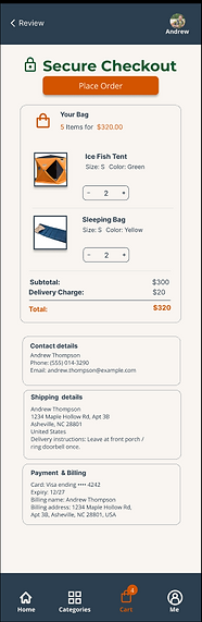
The initial wireframes showed a direct flow from Cart → Thank You page. This skipped a review step, leaving users unsure if their selected items and details were correct. During testing, participants expressed hesitation, double-checked the cart multiple times, and lacked confidence in completing the purchase.
The refined mockups added a Secure Checkout review step before the confirmation page. This new screen displays a clear summary of items, total cost, and order details (shipping, contact, payment), directly addressing Priority 0 insights. By providing transparency and reassurance, the updated flow builds trust, accuracy, and confidence, reducing hesitation and making checkout smoother.
Impact (tied to your Priority 0 insights)
-
Trust & Accuracy: Users now see confirmation of product details before paying.
-
Transparency: Extra details reduce hesitation and confusion.
-
Confidence: The “Secure Checkout” step reassures users and improves completion rates.
-
Error Prevention: The review page prevents users from accidentally purchasing the wrong items.
After Usability Study
CampEasy app Icon
The CampEasy app icon was designed to reflect the brand’s outdoor identity with a simple, modern aesthetic. The dark navy background represents stability and trust, while the orange typography conveys warmth and energy. The green tent and mountain shape tie directly to the camping theme, making the icon instantly recognizable.
On the iPhone screen, the CampEasy icon stands out clearly among other apps due to its bold contrast and minimal design. Its legibility and color balance ensure it remains easy to spot, even on a busy home screen—reinforcing brand visibility and user accessibility.
Mockups
These mockups show the complete shopping journey from home → categories → product → cart → checkout → confirmation, while the bottom navbar uses orange to highlight the active page, making navigation intuitive and consistent throughout the flow.
Impact (tied to your Priority 1 insights)
Based on Priority 1 insights, users needed a more consistent and intuitive navigation structure to confidently move through the shopping flow. In the mockups, these issues were addressed:
-
The bottom navigation bar was color-coded, with the active icon highlighted in orange while inactive icons remained white. This gave users a constant, clear indicator of where they were in the app.
-
The top navigation bar was streamlined to include a clearly visible back button and screen title, making it easier for users to retrace their steps without confusion.
Together, these changes reduced hesitation, improved navigation confidence, and supported smoother decision-making.
Accesiblity Considerations
I applied accessibility best practices throughout my design to ensure inclusivity and usability for all users, regardless of ability or device.
-
Color Contrast – I applied high-contrast colors (dark backgrounds with white/orange text) to ensure readability for users with low vision or color blindness.
-
Consistent Navigation – The bottom navbar and top back button were designed consistently across screens so users with cognitive or learning challenges can predict where to go.
-
Clear Visual Hierarchy – Headings, buttons, and key actions (like “Checkout Securely” or “Place Order”) are emphasized with size, color, and spacing to make navigation intuitive for all users.
-
Icon + Text Labels – Each bottom nav icon includes a text label (Home, Categories, Cart, Me), ensuring clarity for users who rely on screen readers or who may not recognize icons alone.
-
Interactive Element Sizing – Buttons and touch targets were designed large enough with adequate spacing so they are easy to tap on mobile, supporting users with motor limitations.
Color Palette and Accessbility
I built the palette around a dark navy #1E293B for headers/nav and a warm off-white content background #F8F5F0 to reduce eye strain and keep the UI inviting. Bright orange #F97316 is the primary accent for CTAs and active states, while forest green #228B22 supports the outdoor theme. For readability, I use white #FFFFFF text on dark surfaces and navy #1E293B (with light gray #D1D5DB for secondary text) on the off-white background. This mix preserves strong contrast, clear hierarchy, and a nature-inspired identity.
Before Usability Study


VS.
After Usability Study


Mockups


Color Palette and Accessbility
Key Takeaways
Impact
The redesigned flow gave users more trust and confidence in the checkout process. During testing, participants said the added review step made them feel reassured about their order, reducing hesitation and improving the overall shopping experience.
What I learned
Through this project, I learned the importance of usability testing to uncover hidden pain points like lack of trust in the cart and how small design changes can make a big impact. I also gained hands-on experience applying the product development cycle, balancing accessibility, and using iteration to build more user-centered solutions.
Next Steps
1. Conduct further usability testing
The next step would be to test the updated mockups with a larger and more diverse group of users. This would validate whether the added review step and navigation changes continue to build trust and confidence in the checkout flow.
2. Expand features for real-world use
I would explore adding features such as personalized recommendations, filtering options, a compare feature, and accessibility enhancements to improve the shopping experience and support a broader user base.
3. Prepare for development handoff
Finally, I would create detailed design specifications and interactive prototypes to hand off to developers. This ensures the design vision is accurately implemented and sets the foundation for future iterations.